2025 Gartner® Market Guide for Event Intelligence Solutions
Selector Recognized as a Representative Vendor.
2025 Gartner® Market Guide for Event Intelligence Solutions
Selector Recognized as a Representative Vendor.

On this page

The Control Plane Highway: Networking’s Hidden Infrastructure

When we discuss networks, we typically envision data packets racing along physical wires like vehicles on a highway. But beneath this visible traffic flows another critical pathway that few recognize: the control plane highway. This unseen infrastructure, where routing information flows between devices, makes the data highway possible. Before user data can flow, millions of paths must be established, creating a parallel network of equally vital importance.

Understanding networks through this dual-highway perspective doesn’t just satisfy intellectual curiosity—it transforms how we approach network design, troubleshooting, and optimization. By reframing our perception to see the control plane as a highway, we unlock powerful new opportunities for network intelligence, where machine learning and AI generate unprecedented analytics, revealing patterns and predictive insights that have remained largely untapped despite the control plane’s decades-long existence.

Reimagining Network Architecture

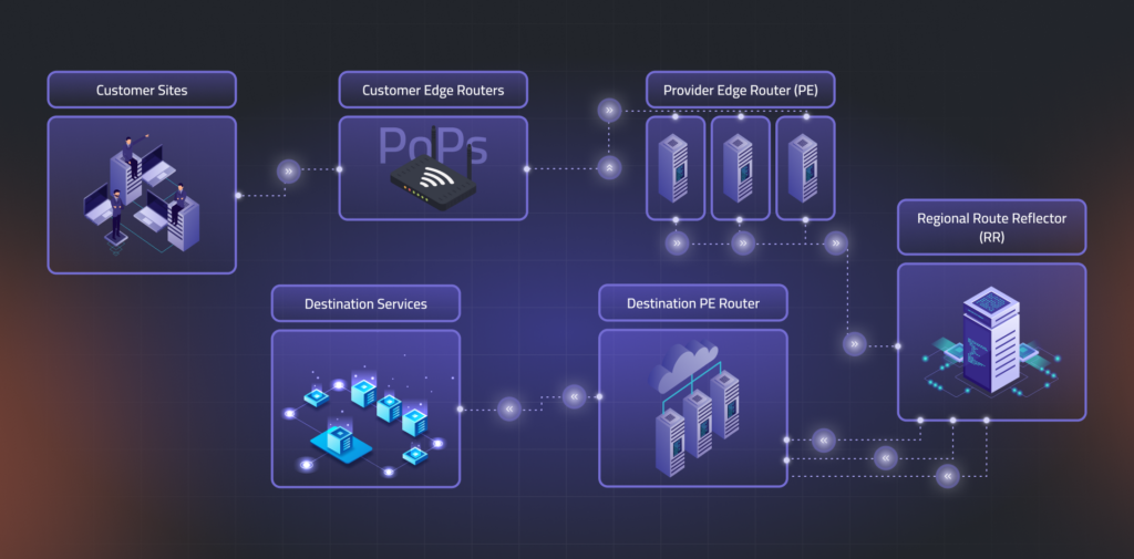
Service providers build networks that connect customers to their services and branch offices using layer-3 VPNs. At the network edge, routes are exchanged, which travel through a system of route reflectors before reaching the provider edge routers closest to each customer location.

Route reflectors (RRs)—physical devices or virtual software—are organized in a carefully designed hierarchy. Network architects group them strategically and split routing tables, so no single RR must store all routes. Operators create specific rules for sharing routes to ensure each customer location gets all the routing information it needs while preventing any individual reflector from becoming overloaded.

When customers connect from various global Points of Presence (PoPs), routing information travels through a carefully designed hierarchy:

  1. Customer edge routers connect to local provider edge routers
  2. Provider edge routers communicate with RRs
  3. RRs exchange information with other RRs (across regions)
  4. Information propagates to the provider edge routers near destinations
  5. Finally reaches customers’ local networks
Diagram of the control plane routing path, showing customer sites, PoPs, provider edge routers, destination services, and regional route reflectors in a hierarchical flow.

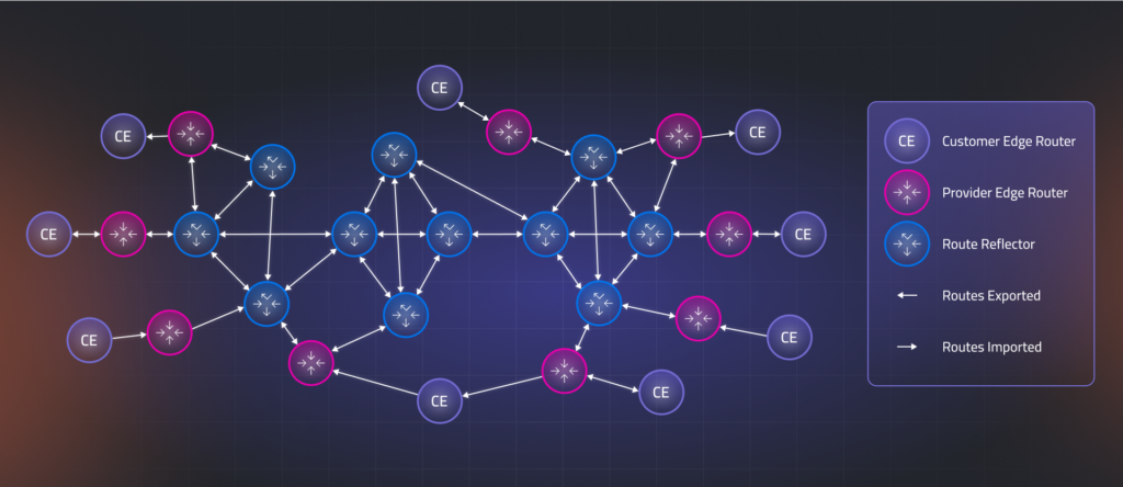
The Control Plane Highway Visualization

Picture this intricate routing ecosystem as an expansive highway network displayed on a geographic map. Each critical component—customer-edge routers, provider-edge routers, and route-reflectors—appears as a distinct node positioned at its physical location. 

Routing information flows along directional arrows between nodes, with the arrow’s thickness proportional to the traffic volume through the number of routes being exchanged. 

This customer-specific visualization reveals the complete journey of routing data, from its origins at various entry points to its distribution across all customer locations. The topology showcases the dynamic propagation of routes as they flow through the hierarchical system, highlighting potential bottlenecks, redundant paths, and the efficiency of the route distribution architecture.

Network topology map visualizing route exports and imports between customer edge routers, provider edge routers, and route reflectors, with directional flow indicators.
 Customer-Centric Control Plane Highway

Analytics and Insights: The Control Plane Highway Monitoring System

When we visualize the control plane as a highway system, complex routing data becomes intuitively accessible. Instead of being scattered across multiple databases and router tables requiring specialized query language knowledge, information appears as an interactive map with nodes (network elements) and edges (sessions) that anyone can understand.

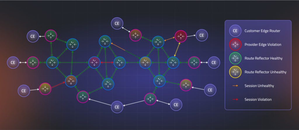
Traffic Control Centers: Monitoring Network Nodes

Every junction on our highway (routers and reflectors) becomes clickable, revealing critical operational data. Like a modern traffic control center, we can instantly see:

  • Traffic volume: Routes exported, imported, or reflected
  • Junction configuration: Equipment settings and state
  • Resource utilization: CPU and memory usage (intersection capacity)
  • Customer impact: How much routing table space each customer occupies
  • Overall health indicators: KPIs that evaluate node performance

These metrics translate visually into familiar traffic signals: green lights indicate healthy nodes, yellow-orange lights warn of developing issues, and red lights signal violations where route propagation may be incomplete or blocked, preventing customers from reaching all their global Points of Presence (PoPs).

Road Condition Monitoring: Analyzing Connection Edges

The highways connecting these junctions (BGP sessions between network elements) provide equally valuable insights. Clicking on any road segment reveals:

  • Traffic patterns: Routes flowing between specific nodes
  • Directional flow: Information exchanged in both directions between provider edge routers, route reflectors, and customer equipment
  • Connection health: Protocol operational status between node pairs

Traffic engineers monitor road conditions; similarly, our visualization uses color-coding to indicate connection health: green for optimal flow, yellow-orange for concerning conditions, and dark red for critical issues blocking route dissemination. Importantly, since each BGP session typically carries routing data for multiple customers across shared infrastructure, the status of a single edge can reveal broader impacts affecting many customers while highlighting redundant paths that maintain connectivity despite local disruptions.

Color-coded visualization of network health across the control plane, highlighting route reflector status, session violations, and unhealthy routing paths.
 Control Plane Highway Monitoring

Patterns, Predictions, and Impact Analysis

The highway metaphor extends naturally to trend analysis and capacity planning. Just as traffic engineers study road usage patterns to anticipate future needs, network operators can visualize:

  • Historical traffic trends: Normal export patterns from customer locations
  • Anomaly detection: Unexpected spikes or dips in route counts
  • Predictive modeling: Forecasting future routing table growth
  • Capacity thresholds: Identifying when route reflectors approach saturation points

Since service providers use shared infrastructure for multiple customers, they must ensure that one customer’s behavior doesn’t create “traffic jams” affecting others. Using “what-if” analysis tools, operators can create virtual simulations for each customer, like digital twins, to analyze potential impacts before they occur.

These simulations allow operators to observe how the control plane highway would respond if a customer exceeded current route limits or SLA thresholds: which paths would experience congestion first, how edge colors would shift from green to yellow to orange to red, and where bottlenecks might develop. This virtual environment enables strategic planning for customer growth and SLA management without risking disruption to the production network, allowing operators to test configuration changes, adjust session capacities, or add new RRs while ensuring service level commitments remain intact, all in a safe environment before implementing changes.

Transforming Network Visibility Through Highway Visualization

The control plane highway metaphor transforms network monitoring by visualizing routing information flows as a dynamic system with traffic signals. This gives operators clear visibility while making complex architectures intuitive for all stakeholders. This approach enables proactive management through trend analysis and simulation, ensuring robust control planes as networks grow increasingly complex.

This approach is valuable for service providers and applies equally to enterprise networks, data centers, cloud environments, and any routing ecosystem. It makes the invisible infrastructure that powers our connected world visible and optimized for future challenges.

Request a demo today to see how Selector visualizes the control plane like never before, empowering your team with deep routing insights and predictive analytics. To stay up-to-date with the latest news and blog posts from Selector, follow us on LinkedIn or X and subscribe to our YouTube channel

More on our blog

Making Sense of Complex Data in Observability Tools

Metrics, analytics, measurements, and parameters – can we truly see these abstractions? Data visualization helps us do just that, bridging the gap between raw information and human comprehension. Visualizing data is like rafting down a river – dynamic, unpredictable, and full of discoveries along the way. In this guide, we’ll explore how to craft visualizations that inform, engage, and inspire. So, grab your paddle and hop aboard! Go with the data’s flow The fundamental principle of effective visualization is working with your data’s inherent structure rather than against it. Like water finding its path, data has natural patterns and rhythms that should guide visualization choices. Recognizing whether you’re working with numbers, categories, or time series helps your visuals flow smoothly and convey insight clearly. Finding the perfect chart for your story The human brain loves patterns. Clear, structured visuals make it easier to spot trends, anomalies, and insights. Here’s a brief overview of which chart types best fit different kinds of data. Temporal data Track changes and trends with: Category-based data Compare groups effectively using: Single-value metrics Display key measurements with: Event and status data Visualize occurrences and states through: Numerical datasets Analyze distributions and relationships using: Nested structures Represent layered information with: Location-based data Map spatial information through: Network structures Illustrate system relationships with: Designing for humans  Selecting appropriate visualization types is only half the battle. Even the best-matched chart needs thoughtful UX design to communicate its story honestly. Adopting these core principles will help you transform raw data into clear insights. Designing for real-world data  Simple charts rarely stay simple. A line chart that works for a few series can quickly spiral into chaos with hundreds of series. Here are some of the challenges we encountered – and the design solutions that brought order back. 1. Untangling line charts Building a basic line chart sounds easy – two axes and a ready-made component from a library like Highcharts. But in data-heavy environments, “basic” rarely exists. The backend often delivers dozens of overlapping lines, sometimes on multiple Y-axes, and suddenly the problem shifts from building a chart to making it readable. To bring order to the chaos, our team designed a few key improvements: What started as a simple line plot evolved into an adaptive visualization tool – one that helps users explore data rather than get lost in it. 2. Handling missing data Data is never static – it fluctuates, pauses, and sometimes disappears. Visualizations need to handle all these moments gracefully, from empty timelines to overwhelming data bursts.  In our case, the challenge was visualizing empty states. Simply hiding a widget with no data wasn’t an option – it confused users and broke context. The solution was to differentiate between intentional emptiness and missing data. If an empty state was expected, we showed it clearly. If data was missing, we made that absence explicit. This simple distinction prevented confusion and helped users instantly understand what was happening. 3. Designing beyond color Relying solely on color in data visualizations is risky. Not all users can distinguish hues, large datasets can overwhelm the eye, and assigning a unique color to every data point quickly creates visual clutter. In our product, we found a more reliable approach was logical grouping and structured organization. Whenever possible, we minimized color use, relying on layout, grouping, and contrast to communicate meaning. This not only reduced clutter but also made the design more accessible and easier to interpret. 4. Looking for contrast in Stacked charts Color alone often isn’t enough. In stacked event charts, with many thin layers, maintaining clear contrast can be extremely challenging. While WCAG guidelines ensure high contrast for text and UI elements, there are no universal rules for data visualization – especially when hundreds or thousands of points each need a distinct color. Not using standard status colors like red, green, or yellow for datasets can make differentiation even harder. In our product, we applied several practical strategies to improve readability: By combining careful color choice, thoughtful ordering, and adaptable display modes, we made even densely layered stacked charts clear, accessible, and easy to interpret. 5. Which red is more red Status colors can be surprisingly tricky. Many users have some form of color blindness, cultural associations vary, and too many shades make it hard to remember what each color represents. In monitoring and observability apps, this problem is common: multiple greens, reds, and yellows often appear simultaneously, leaving users to wonder – which red is more severe? Which green indicates optimal health? As a UX designer, I aim to simplify interfaces by reducing status colors to the essentials. One shade each for error (red), warning (orange), and healthy (green) is usually sufficient. When we needed to indicate “almost healthy” widget cells, we faced a design challenge: brief, insignificant errors sometimes triggered a red state, frustrating operational engineers who had to investigate issues that were no longer relevant. Introducing new color shades would have increased cognitive load and emotional impact – which green indicates optimal health? Which red signals real risk? Our solution was elegant and subtle: we kept the original green but added a dotted background. This visually communicated that the status was fundamentally healthy while hinting at minor past turbulence – all without introducing new colors or confusing the user. Building blocks Chart library selection For most charts in our product, we relied on Highcharts. Its demos made it easy to test against our needs, and it covered the majority of our visualizations.  Highcharts is powerful out of the box – a few tweaks deliver interactive, attractive charts. Custom requirements, however, can be tricky. The API is extensive and challenging to navigate, some options override others, and documentation isn’t always complete. Snippets and fiddles help, but logging is limited. Despite these challenges, Highcharts is versatile, handles updates smoothly, and produces high-quality visualizations. A paid license is required, but the effort is well worth it. Table management For advanced tables, we chose AG Grid. It excels at displaying

Navigating External Outages: How Selector Cuts Through the Cloudflare Noise

Yesterday’s widespread Cloudflare outage reminds us how crucial external dependencies are to the stability of our own applications. When a key edge provider like Cloudflare goes down, the impact on your internal monitoring systems can look like a catastrophic, internal system failure triggering a massive storm of alerts and sending engineering teams into frantic, misdirected debugging sessions. The difference between knowing and guessing during an outage isn’t just about response time. It’s about maintaining customer trust and making informed decisions when every second counts.Selector is specifically designed to cut through this noise, rapidly identifying the true root cause as external and drastically reducing the time it takes to restore sanity. It turns a potential internal panic into a confident, swift response. How Selector Specifically Assists During a Cloudflare Outage When Cloudflare goes offline, your internal monitoring dashboards light up with red. The outage appears to be a total system failure because traffic has dropped to zero or error rates have spiked across the board. Selector uses AIOps, correlation, and synthetic monitoring to separate internal health from external failure. 1. Rapid Root Cause Isolation (Mean Time to Innocence) When an edge failure occurs, the first instinct is to check internal servers. Selector provides an immediate answer, establishing your “Mean Time to Innocence.” 2. Noise Suppression (End Alert Storms) A widespread external outage generates a massive wave of cascading alerts. Load balancers report health check failures, synthetic tests fail, and every application microservice reports an error spike because they are starved of traffic. 3. Synthetic & Path Monitoring Selector can leverage data from existing synthetic monitoring tools (or utilize its own capabilities if configured) to perform active reachability testing. 4. Automated Remediation & ChatOps Once the root cause is isolated, the incident response needs to be fast and decisive. 5. Automated Incident Creation and Ticketing A critical step in managing any major outage is the creation of a formal incident record. Selector automates this process to ensure no time is wasted in documentation. Integrated Incident Workflow and Tracking Once the incident is created, Selector maintains its role as the source of truth, centralizing information flow and tracking progress. 🔑 How Selector Helps Reduce Pain and Alerts for Teams By leveraging AIOps and advanced correlation, Selector transforms a chaotic, internal-looking incident into a controlled, externally focused response. Would you like to see a demonstration of how Selector can ingest your current monitoring data to provide this kind of correlated insight? Get a demo here

Beyond Isolated AI: How the Selector MCP Server Connects Agents, Context, and Action

AI in network operations is evolving faster than ever. But while new models and agents are emerging almost daily, they’re often working alone, with each confined to its own context, data, and domain. One model might analyze telemetry, another handles automation scripts, and a third generates summaries or recommendations.  Each model might be intelligent on its own, but without a way to share context, they end up thinking in isolation, limiting what they can achieve together.  The Coordination Problem in AI-Driven Operations Modern operations rely on a growing web of AI models, tools, and APIs. But these components rarely speak the same language. Data pipelines feed one agent, while another operates on different metrics. Automation scripts are triggered without understanding the “why” behind an alert.  Without a common framework for coordination, every tool acts as if it’s the only one in the room.  That’s where the Model Context Protocol (MCP) comes in, and where Selector’s MCP Server redefines how AI agents reason, collaborate, and act across complex environments.  The “USB-C” of AI MCP is often described as the USB-C of artificial intelligence — a universal connector that lets models, agents, and tools exchange context and coordinate actions through a common language.  Selector’s MCP Server brings that concept to life for real-world operations. It provides a secure, managed environment that enables Selector and external MCP clients or servers to communicate, exchange context, discover tools, and orchestrate decisions across systems that previously had no way to connect.  To put it simply: MCP makes Selector interoperable with the broader AI ecosystem, from IDE copilots and custom agents to cloud automation platforms.  What Makes Selector’s MCP Server Different Selector’s MCP Server was built for interoperability, not isolation. It’s designed to extend the power of the Selector AI Platform (S2AP) beyond its own boundaries, connecting to third-party agents, reasoning frameworks, and developer tools through open, standards-based collaboration.  Instead of replacing existing systems, the MCP Server connects them, turning disconnected capabilities into a cooperative, context-aware network.  How It Works (in Plain English) At its core, the Selector MCP Server acts as a translator and bridge between MCP clients (agents or applications) and tools or resources (APIs, automation, databases, reasoning modules).  Deployment is simple: provide your Selector instance URL and OAuth2 token, and any MCP-compatible agent can begin collaborating with Selector’s AI and data ecosystem.  Connected Intelligence in Action The power of MCP becomes clear when you see how it ties the whole ecosystem together, from data sources and AI models to operational outcomes.  The Selector MCP Server connects all layers of the AI-driven operations landscape, enabling context-aware collaboration among tools that typically operate in isolation.  Where MCP Fits Within the Selector AI Platform (S2AP) The Selector AI Platform (S2AP) remains the core — where data is ingested, correlated, and enriched for AIOps, RCA, and natural-language interaction. The MCP server builds on top of that foundation as an integration layer that extends Selector’s reach beyond its native environment.  In essence, MCP makes S2AP collaborative. It allows the platform to participate in multi-agent ecosystems without changing how customers deploy or use Selector today.  From Single-Agent Tasks to Multi-Agent Workflows With MCP in place, Selector users can evolve from isolated automations to connected intelligence. Agents can:  This is how AI in operations shifts from automation to coordination.  Why It Matters For network and IT teams, this means faster RCA, fewer silos, and more trustworthy operations. For business leaders, a clearer path to intelligent operations that adapt to changing environments. For the AI community, a practical framework for interoperability, one that connects specialized agents into something greater than the sum of their parts.  The Selector MCP Server isn’t about replacing existing tools, but rather about connecting them. It’s the bridge between your AI platform and the rest of the intelligent ecosystem.  As more systems adopt MCP, organizations that use Selector won’t be locked into a single AI framework. They’ll be part of a shared, open protocol for reasoning, collaboration, and automation.  Stay Connected Selector is helping organizations move beyond legacy complexity toward clarity, intelligence, and control. Stay ahead of what’s next in observability and AI for network operations:  Ready to see what modernization should really look like? Schedule a demo with our team.