What Is Network Visualization?
Network visualization is the process of visually representing networks of connected entities, like devices, data flows, or relationships, using nodes and links. This technique helps in understanding complex data, identifying patterns, and improving network management by providing a clear visual overview of the network’s structure and behavior.
In IT environments, network visualization helps teams monitor infrastructure, diagnose issues, and optimize performance by mapping devices, connections, protocols, and data flows across a digital landscape.
Benefits of network visualization include:
- Enhanced visibility: Provides a clear and intuitive overview of the network’s topology and behavior, making it easier to understand the relationships between different components.
- Improved troubleshooting: Helps in quickly identifying the root cause of network issues by visualizing the flow of data and the connections between devices.
- Proactive management: Enables proactive identification of potential problems, like congestion or security threats, by analyzing network patterns and trends.
- Informed decision making: Helps in making better decisions about network design, capacity planning, and resource allocation.
- Data exploration and analysis: Supports the discovery of hidden patterns, clusters, and relationships within complex datasets that might not be apparent in tabular data.
This is part of a series of articles about network topology.
Common Visual Representations of Computer Networks
1. Network Maps
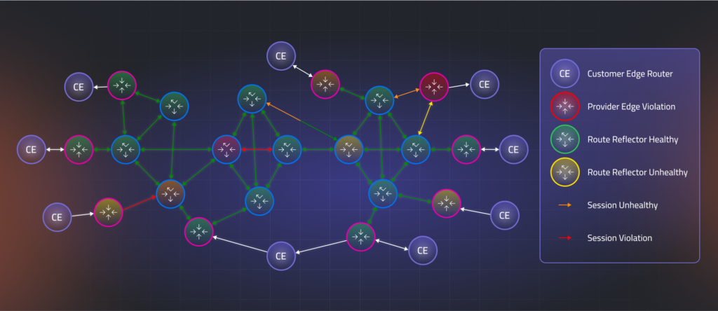
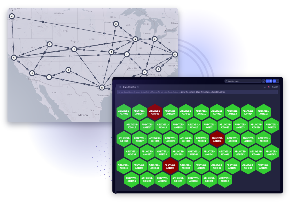
Network maps chart devices (nodes) and their interconnections (edges) using diagrams reminiscent of physical or logical layouts. These representations often resemble blueprints, displaying routers, switches, servers, and endpoints in positions that reflect actual or logical geography. Network maps may also incorporate layers to distinguish between physical, data link, or application-level connections, aiding in segmentation and access control analysis.
Interactive network maps typically allow users to hover over or click elements to reveal details, status metrics, or configuration properties. Color-coded alerts, bandwidth indicators, and live status updates turn static diagrams into dynamic monitoring tools. This immediacy helps teams maintain situational awareness and coordinate change management.
2. Force-Directed Graph Layouts
Force-directed graph layouts in computer network visualization simulate physical forces to arrange nodes—representing devices like routers, switches, or virtual machines—based on their connectivity. Nodes with stronger or more numerous connections attract each other, while loosely connected nodes are repelled. This results in an intuitive layout where clusters represent tightly connected subsystems and outliers reveal isolated or misconfigured components.
These graphs are especially useful for visualizing complex software-defined networks (SDNs), mapping inter-service communications in microservices, or analyzing East-West traffic within data centers. They help uncover hidden dependencies, visualize redundant paths, and identify potential bottlenecks or single points of failure in both real-time and historical analyses.
3. Charts, Graphs, and Dashboards
Traditional charts—bar graphs, line charts, pie charts—and dashboards complement network maps by quantifying key metrics over time. Capacity utilization, latency, error rates, and application throughput are visualized to reveal trends, peaks, and anomalies. Dashboards centralize these views, combining charts and mini-maps into a unified interface for at-a-glance status and deep dives into problem areas.
Visual dashboards allow customizable filtering, time-slicing, and alert integration. Stakeholders can monitor service level agreements (SLAs), track real-time incidents, or analyze historical performance with minimal friction. This variety of visual forms provides both the macro and micro perspectives required for effective monitoring and long-term planning.
4. Hierarchical and Radial Views
Hierarchical visualizations lay out nodes in tree-like structures, representing parent-child relationships, dependencies, or authority flows. These are useful for illustrating directory structures, routing hierarchies, and organizational charts. Radial layouts offer a circular version, placing the root node at the center and radiating children outward, simplifying the view for deep hierarchies or multilayered dependencies.
Both hierarchical and radial views excel at visualizing layered protocols, nested networks, or systems with strict inheritance or delegation pathways. They reduce cognitive load by grouping related components, making it easier to see the scope of impact for outages, policy changes, or escalation paths within layered networks.
Practical Use Cases of Network Visualization
Topology Mapping and Documentation
Topology mapping captures the structure of a computer network by visualizing how devices and systems interconnect. These maps serve as the foundation for documentation, compliance audits, and operational planning. By representing routers, switches, firewalls, and end devices in a structured format, teams can understand data flow, redundancy, and segmentation across physical, virtual, and cloud environments.
Visual topology documentation is essential for onboarding new team members, planning infrastructure changes, and maintaining security policies. Layered maps can distinguish between physical cabling, IP subnets, and overlay networks such as VLANs or VPNs, allowing precise visibility across the network stack.
Monitoring and Performance Analytics
Network visualization supports continuous monitoring by graphically representing device health, link utilization, and protocol behavior. Dynamic views integrate with monitoring tools to show real-time metrics like latency, packet loss, or CPU load directly on top of topology diagrams. This enables network operations teams to correlate performance issues with specific devices or paths.
Historical performance data can also be visualized to detect long-term trends, evaluate capacity needs, or verify compliance with service level agreements (SLAs). Effective visualizations help isolate performance degradation zones, validate QoS policies, and prioritize remediation based on network criticality.
Security Analysis and Threat Detection
Network visualization enhances security operations by revealing abnormal communication paths, unauthorized devices, or policy violations. By mapping access patterns and visualizing firewall rules or access control lists, teams can identify misconfigurations and potential attack vectors. Force-directed or radial layouts are often used to show connections between internal assets and external entities, making lateral movement or exfiltration attempts more visible.
Security information and event management (SIEM) platforms often feed into these visualizations, allowing SOC analysts to correlate alerts with network topology. This supports faster root cause analysis, reduces mean time to detect (MTTD), and improves response coordination.
Troubleshooting and Path Analysis
During incident resolution, network visualization helps trace the path of data across the infrastructure, identifying where packets are dropped, delayed, or misrouted. Tools that highlight routing paths, link statuses, and interface errors enable technicians to pinpoint issues like duplex mismatches, BGP route leaks, or broken links.
Interactive visualizations allow teams to simulate traffic flows or isolate changes from recent updates. This reduces downtime by enabling faster diagnosis and validation. Combining real-time metrics with structural views streamlines troubleshooting of intermittent issues and supports proactive root cause analysis.
Best Practices in Network Visualization
Organizations should consider the following practices when planning their approach to visualizing their network.
1. Understand Your Network Topology
Effective network visualization starts with a comprehensive understanding of how devices—such as routers, switches, servers, and endpoints—are interconnected and communicate across the IT environment. This includes physical links, logical groupings like VLANs, and software-defined overlays.
To ensure accurate visualizations, document every segment of the network: on-premises hardware, virtualized infrastructure, and cloud-based resources. Include ephemeral assets such as containerized workloads and autoscaling groups. Updated topology maps help teams respond to incidents, plan upgrades, and verify configurations by reflecting the current state of the network in real time.
2. Choose the Right Layout and Visualization Type
Different network layouts suit different purposes. For example, physical topologies benefit from rack-based or geographic maps that reflect actual device placement. Logical or software-defined networks, on the other hand, are better served by force-directed graphs or hierarchical trees that show relationships and data paths more clearly.
Selecting the right layout depends on the specific task—troubleshooting, capacity planning, or access control—and the viewer. Engineers may need detailed visualizations showing protocols and throughput, while non-technical stakeholders benefit from dashboards that highlight service-level metrics. Matching the layout to both network structure and user role improves clarity and actionability.
3. Simplify and Prioritize Information
Large-scale computer networks can generate overwhelming amounts of data. Visualizations must avoid clutter by focusing on essential components and interactions. Unused ports, inactive nodes, or background processes should be deprioritized or hidden, while critical links and performance metrics are emphasized.
Grouping related devices and allowing filtered views—such as isolating specific subnets, protocols, or traffic types—lets users focus on what matters most. Highlighting congestion, outages, or policy violations using color or size variations helps operators detect and act on key events faster.
4. Use Effective Visual Design Principles
Network visualizations should be designed for clarity and ease of interpretation. Use consistent colors to indicate status (e.g., green for normal, red for critical), icons that clearly represent device types, and scalable labels that remain readable across zoom levels.
Visual hierarchies help distinguish core devices from peripheral ones. For example, central routers might appear larger or in bold colors, while edge devices are toned down. Good design ensures that important patterns—like traffic bottlenecks or misconfigurations—stand out immediately, reducing the time required to analyze or act.
5. Ensure Scalability and Real-Time Updates
As networks grow in size and complexity, visualization tools must scale to handle thousands of nodes and connections without performance degradation. Techniques like node clustering, hierarchical collapse, and dynamic filtering keep views navigable and useful.
Real-time integration is critical for operational awareness. Visualizations should update live with SNMP data, flow logs, or monitoring feeds, alerting teams to anomalies as they arise. Historical playback can support post-incident analysis, while scheduled refreshes ensure that daily operations reflect the current state of infrastructure. This adaptability makes visualization a core component of modern network management.
Network Visualization with Selector
Selector is a full-stack observability platform with built-in network visualization capabilities that go far beyond basic topology maps. It automatically discovers and visualizes infrastructure components across physical, virtual, and cloud environments — providing interactive, real-time views enriched with telemetry, logs, metrics, and event data.
Selector’s visualization engine dynamically maps services, devices, and their dependencies using multiple layouts — including geographic maps, layered views, and fore-directed graphs — making it ideal for both operational monitoring and executive reporting. Teams can drill into nodes to inspect device health, link status, and recent anomalies, or pivot to correlated performance and alert data without switching tools.
Selector supports a variety of visual forms, including:
- Network maps that show live topology, with overlays for health, alerts, and traffic.
- Force-directed graphs for visualizing service relationships and interconnects in cloud-native and software-defined environments.
- Dashboards that combine charts, mini-maps, and business impact scores to guide troubleshooting and prioritization.
- Hierarchical layouts for understanding layered architectures, application stacks, or routing hierarchies.
Integrated AI models automatically correlate events, identify root causes, and highlight impacted services directly on the visualization. This turns passive diagrams into powerful operational tools for NOC and SRE teams, enabling them to rapidly respond to issues, verify remediations, and analyze trends.
By combining intelligent topology awareness with real-time performance context, Selector transforms network visualization from a static documentation into an active, decision-driving experience.
Learn more about how Selector’s AIOps platform can transform your IT operations.